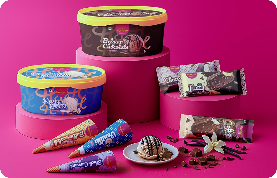
Our Hangyo rebrand drove 200% growth
& 4x valuation
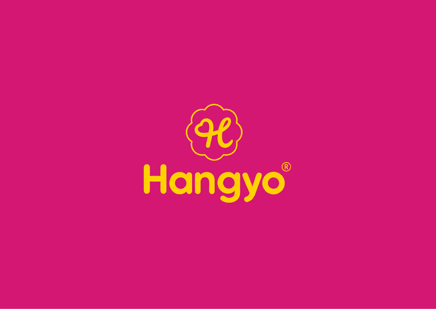
The identity system expresses joy through vibrant colour, clean form, and simplicity. The “H” fused with a heart embodies both humanity and delight, creating a symbol that thrives across every platform. The clean, scalable design keeps everything consistent across packaging, print, digital, and motion while staying modern, cohesive, and playfully bold.