Niranthara
Crafting a new brand in the commoditised puja oil space.
₹0-30 Cr in just 6 months.
Ullas Agarbatti is a devotional products brand rooted in everyday Indian prayer rituals. With a strong presence in traditional households and deep category experience, they were ready to grow beyond incense and build a larger role in the puja universe.
The brief: don’t launch just another puja oil. Create a brand with a clear name, positioning, identity and packaging that can rise above price wars, feel truly “chosen” by devotees, and still stay authentic to tradition.
We rejected the usual puja oil clichés: cluttered labels, loud colours and generic religious imagery. With Nirantara, we built a calm, continuous, “unbroken flame” idea – a minimal yet striking design system that stands out on shelf and feels dignified in the puja room, reimagining what a puja oil brand can be.
Design system
A design system inspired by auspicious floor art.
For Nirantara, we built an identity system rooted in the everyday rituals of Indian homes – the sacred floor drawings known as Kollam in Tamil Nadu, Rangoli in Maharashtra and Alpona in Bengal. These forms are drawn fresh each morning, in a single continuous movement, to invite prosperity and protect the home.
We translated that idea into a modern, minimal line mark: an unbroken path that loops inwards and outwards, echoing both the eternal flame and the cyclical nature of worship. The same geometry then extends into borders, patterns and frames across packs, POSM and digital – creating a cohesive visual language that feels instantly familiar, yet distinctly contemporary.

Super graphics
Visual motifs shaping Nirantara’s sacred iconic identity.
The supergraphics are crafted to feel iconic and instantly tied to Nirantara. Each form began as a hand-drawn sketch on paper, capturing the raw, organic energy found in ritual art. These sketches were then traced and refined digitally so the shapes stay human and rooted in tradition while looking crisp in modern contexts.
The bold forms echo temple motifs and sacred patterns, giving the brand a strong visual pulse across packaging, print, and digital. They anchor the system and make the identity feel alive wherever it appears.

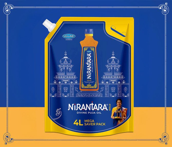
Packaging design
For Nirantara, we weren’t just asked to “do the label”.
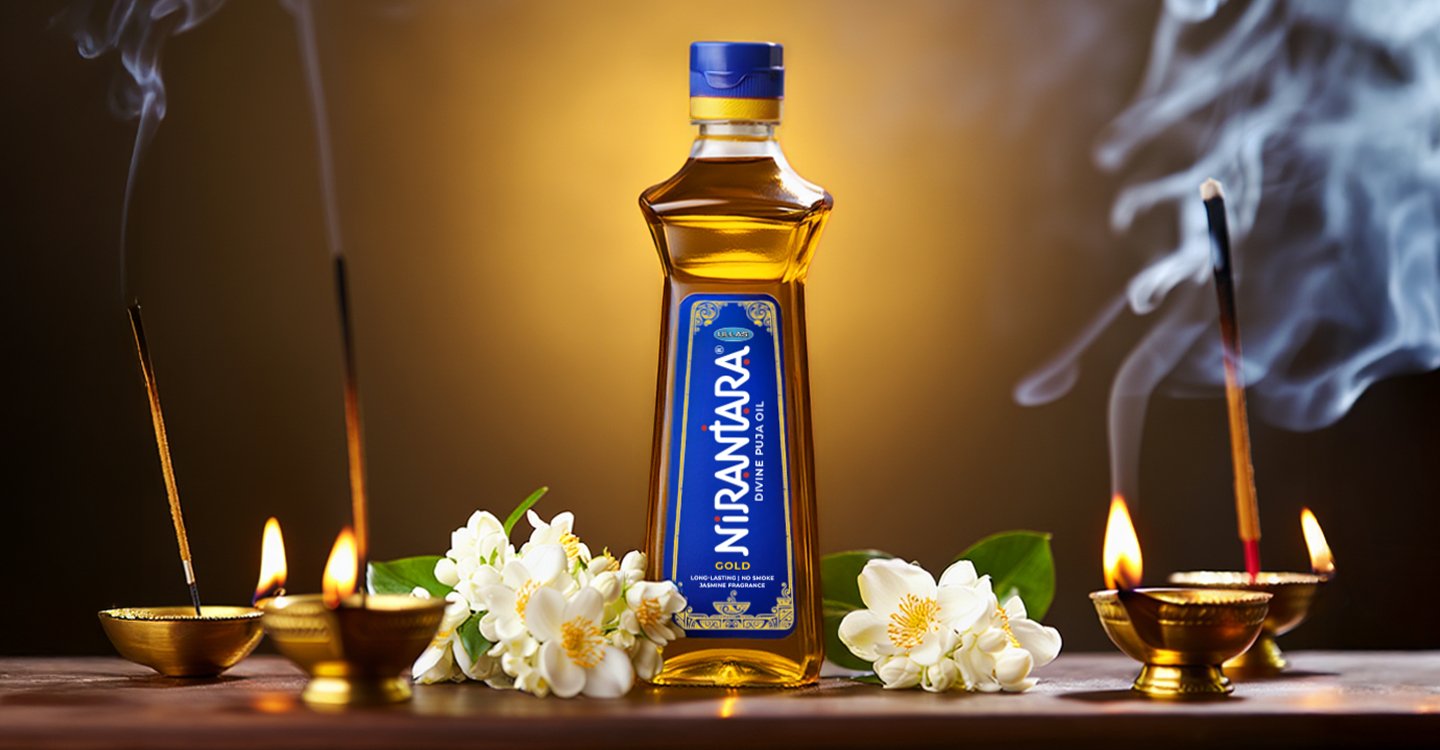
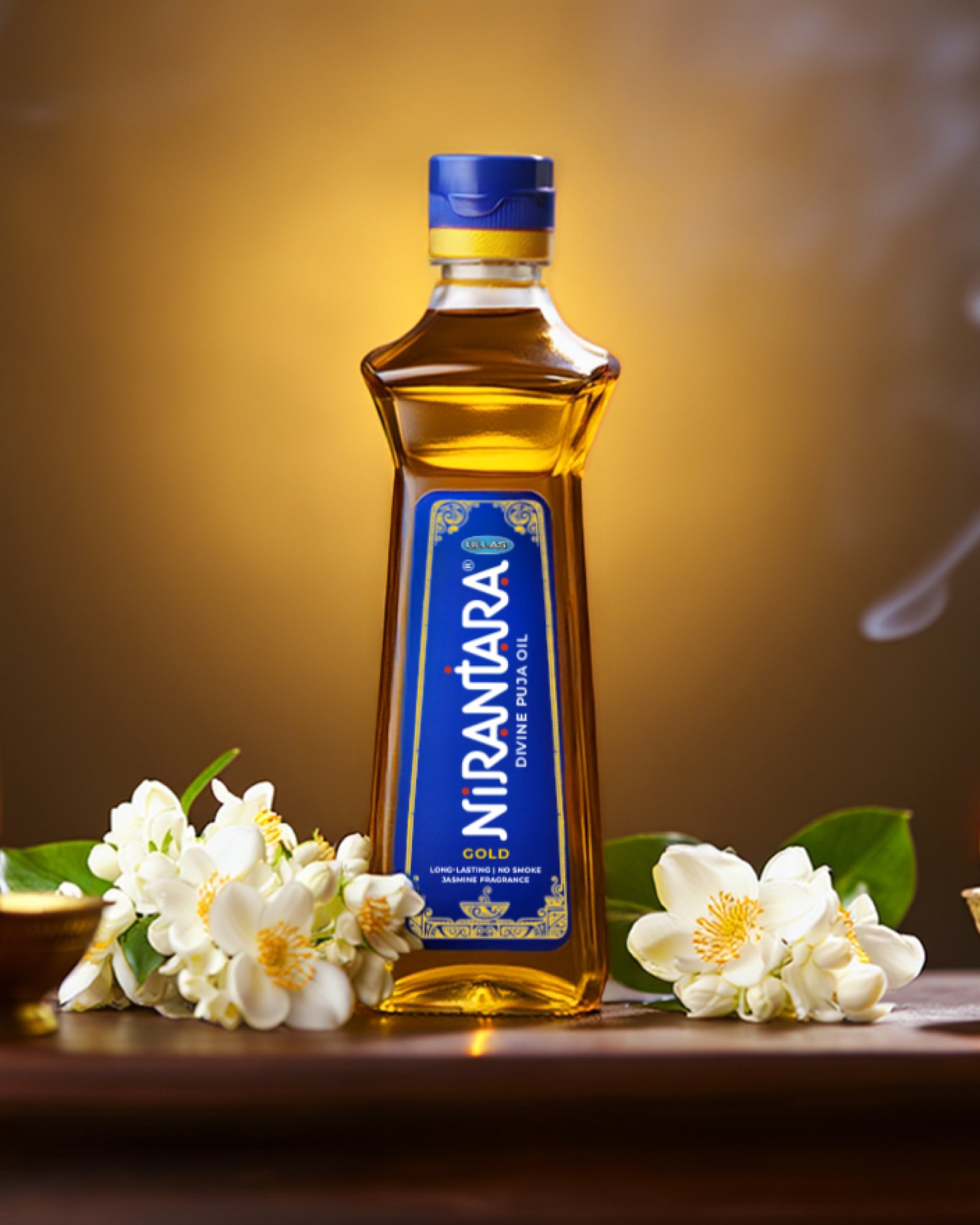
We were entrusted with the bottle itself. Taking inspiration from the sacred stambha, we designed a custom form whose height, proportions and shoulders echo the idea of a modern pillar of light.
In a category where agencies usually only decorate stock containers, this project allowed us to shape the vessel and the visual language as one seamless, devotional object.

Collaboration
Sing with Shri Vijay Prakash
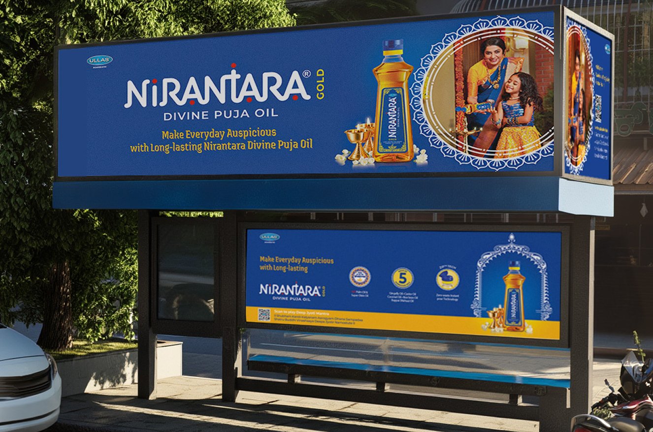
For Nirantara, devotion couldn’t stop at just how the pack looked - it had to be heard too. We collaborated with renowned devotional singer Shri Vijay Prakash to render the Deepa Jyotir mantra especially for this brand. A QR code on the back of the pack lets customers instantly scan and play the mantra every time they light the lamp. In that moment, the bottle stops being just a container of oil and becomes a small, reliable companion for daily prayer.
Brand launch
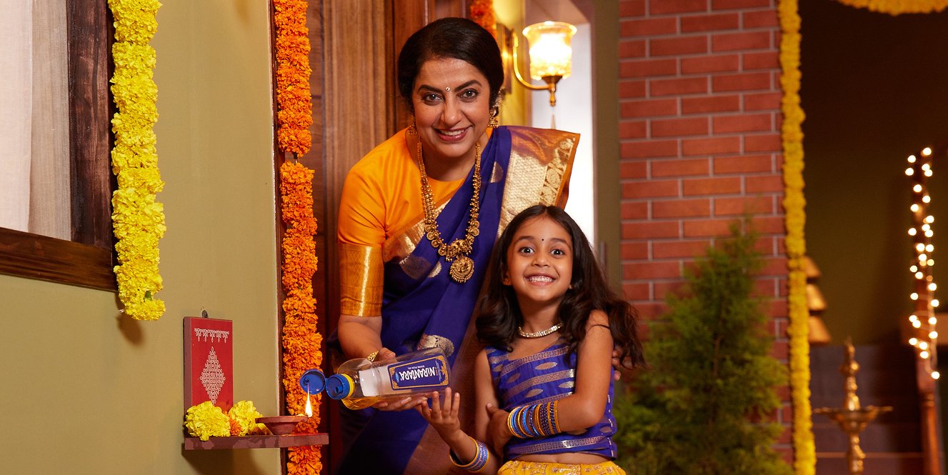
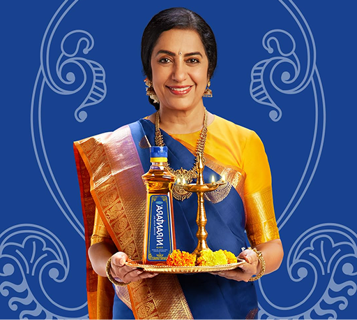
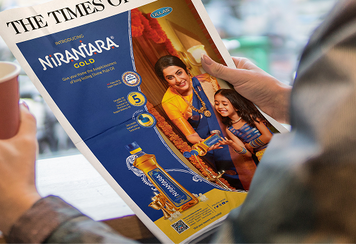
Nirantara launched with renowned actor Suhasini as its brand ambassador
A face already seen as auspicious and familiar in South Indian homes. Her grace, cultural rootedness and on-screen association with rituals make her feel less like a celebrity endorsement and more like a trusted family voice blessing a new puja companion.